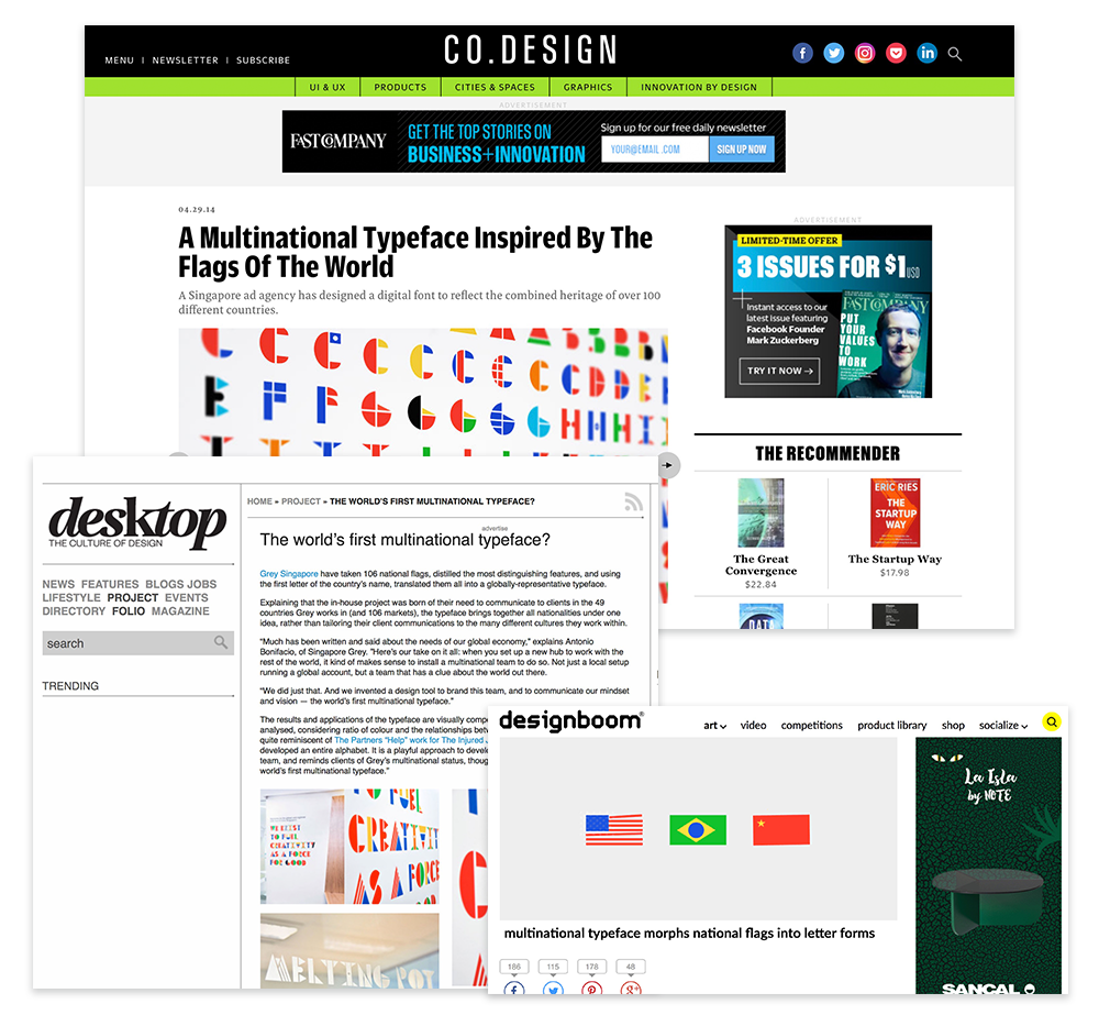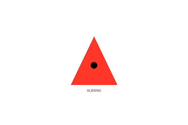
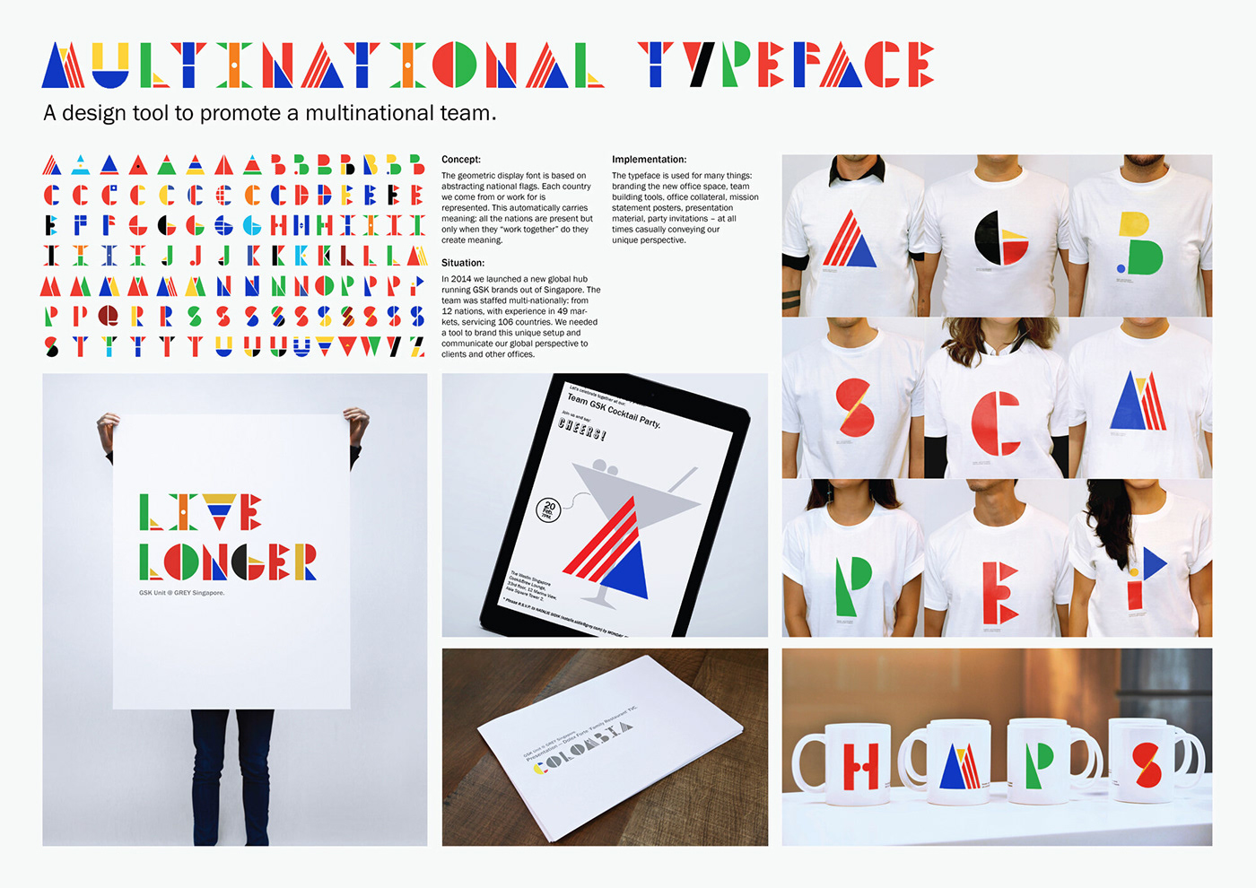
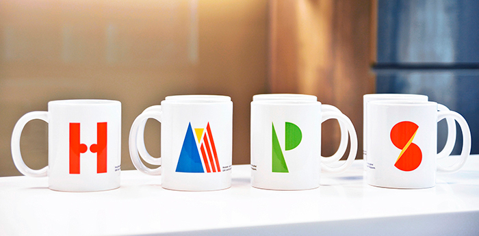
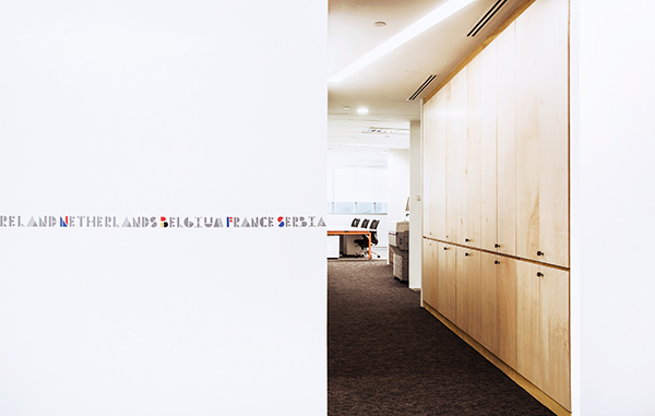
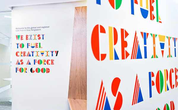
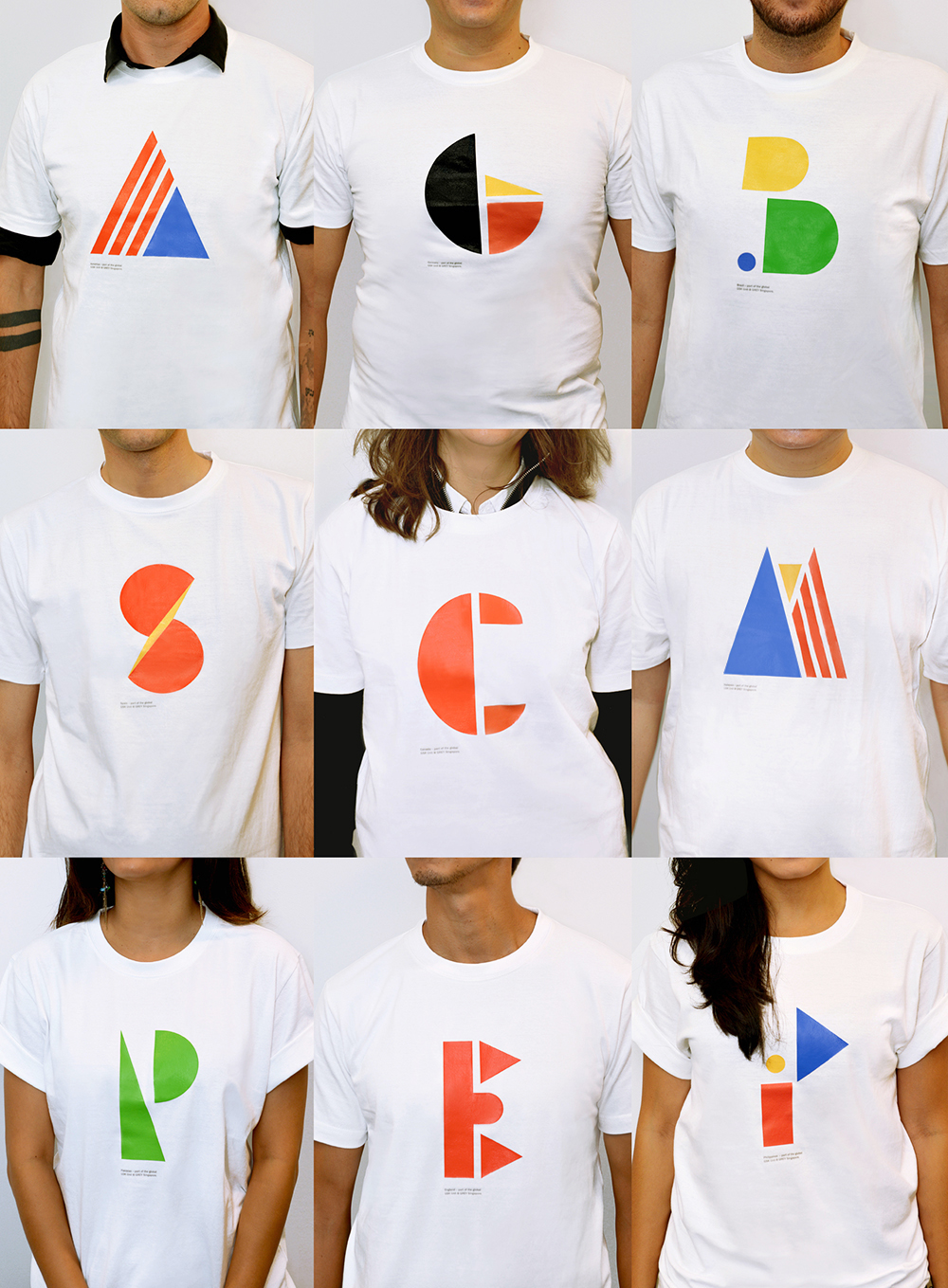
Multinational Typeface
Much has been written and said about the needs of our global economy. In fact: heated debates have and are still taking place about the dichotomy of global vs. local.
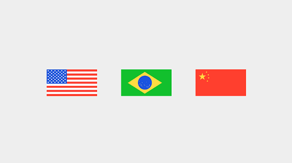
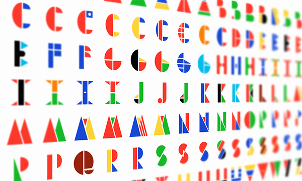
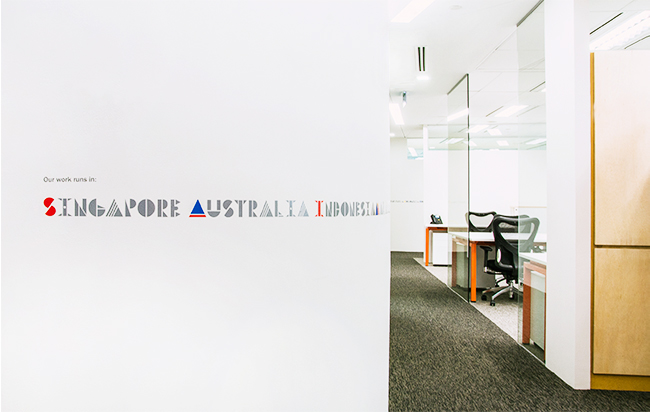
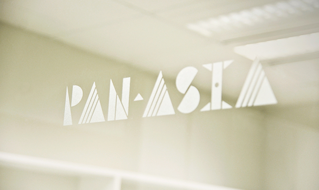
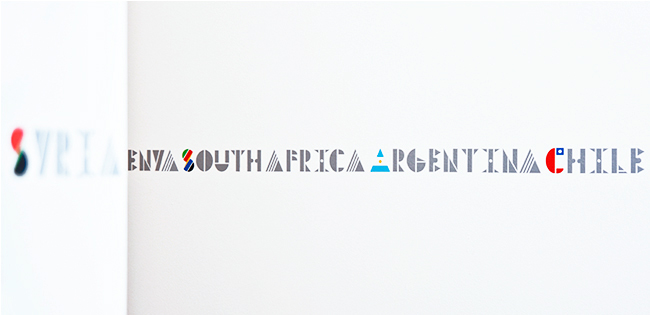
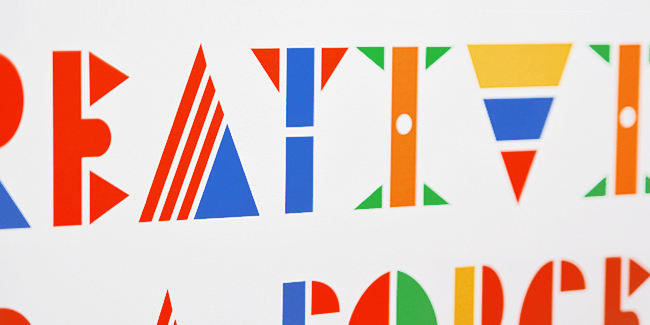
Here's our take on it all: when you set up a new hub to work with the rest of the world, it kind of makes sense to install a multinational team to do so. Not just a local setup running a global account, but a team that has got a clue about the world out there. We did just that. And we invented a design tool to brand this team, and to
communicate our mindset and vision - the world's first multinational typeface.
communicate our mindset and vision - the world's first multinational typeface.


project credits:
ECD APAC: Till Hohmann
CD: Antonio Bonifacio
Copywriter: Till Hohmann
Art Director: Luis Fabra, Nasheet Shadani
Typographer: Luis Fabra
Print producer: Bobby Koh
CD: Antonio Bonifacio
Copywriter: Till Hohmann
Art Director: Luis Fabra, Nasheet Shadani
Typographer: Luis Fabra
Print producer: Bobby Koh
Special thanks to: Eugene Tan and Theia pixelworx.